I used some medium weight watercolor paper for the first two, Arches 180 lb. cold press, which has a nice texture and absorbs water politely. I didn't copy any of Harnois's images, of course, but made up my own spontaneously, using colors that appealed to me. I enjoyed spattering some paint across the paper, as she does, adding some energy to the piece. This kind of painting is about taking risks and playing, not safely making a sure thing.

And like her I added some loose gestural strokes of pencil where needed--even while the paint was damp!
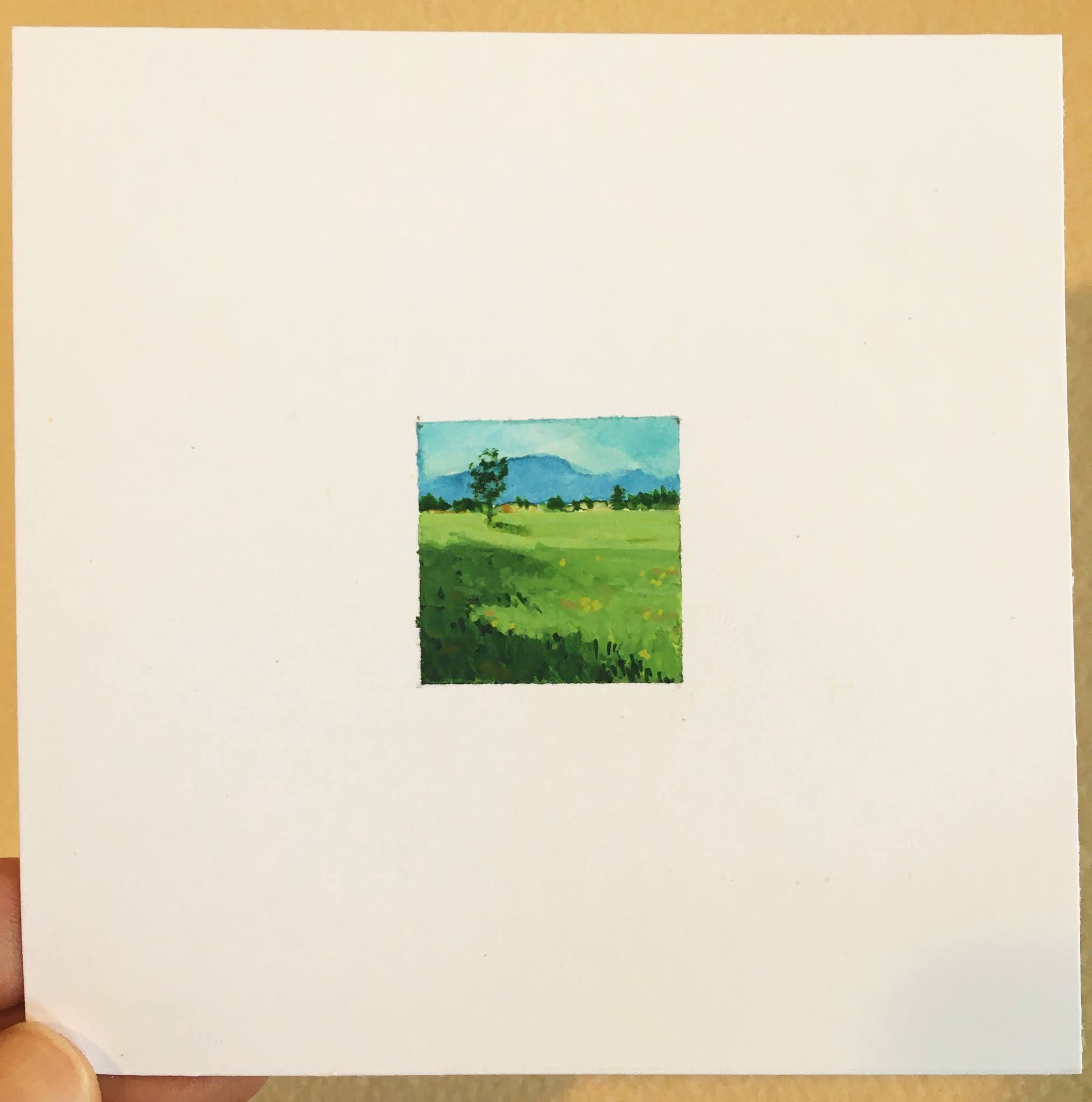
Enjoying the process, I further experimented with Bristol Smooth paper, which is hard, crisp, with hardly any absorption. The paint puddles on the paper. I used the same loose fast strokes, rich color, and spattering technique.


At the end of the day I decided this would be a fun series. I can reinvigorate my enthusiasm any time by watching the many videos that Harnois has available (@pamelaharnoisart) and return to a favorite subject any time I need to splash around in spring.